
python ERA5 画水汽通量散度图地图:风速风向矢量图、叠加等高线、色彩分级、添加shp文件、添加位置点及备注
动机
有个同事吧,写论文,让我帮忙出个图,就写了个代码,然后我的博客好久没更新了,就顺便贴上来了!
很多人感兴趣风速的箭头怎样画,可能这种图使用 NCL 非常容易,很多没用过代码的小朋友,就有点犯怵,怕 python 画起来很困难。但是不然,看完我的代码,就会发现很简单,并且也可以批量,同时还能自定义国界等shp文件,这对于发sci等国际论文很重要,因为有时候内置的国界是有问题的。
数据
本次博客使用的数据为 ERA5 hourly data on pressure levels from 1940 to present数据,数据的下载方式及注册账号,我在前面的博客中都写过,详细可参考以下两篇博客:
http://t.csdnimg.cn/657dg
http://t.csdnimg.cn/YDELh
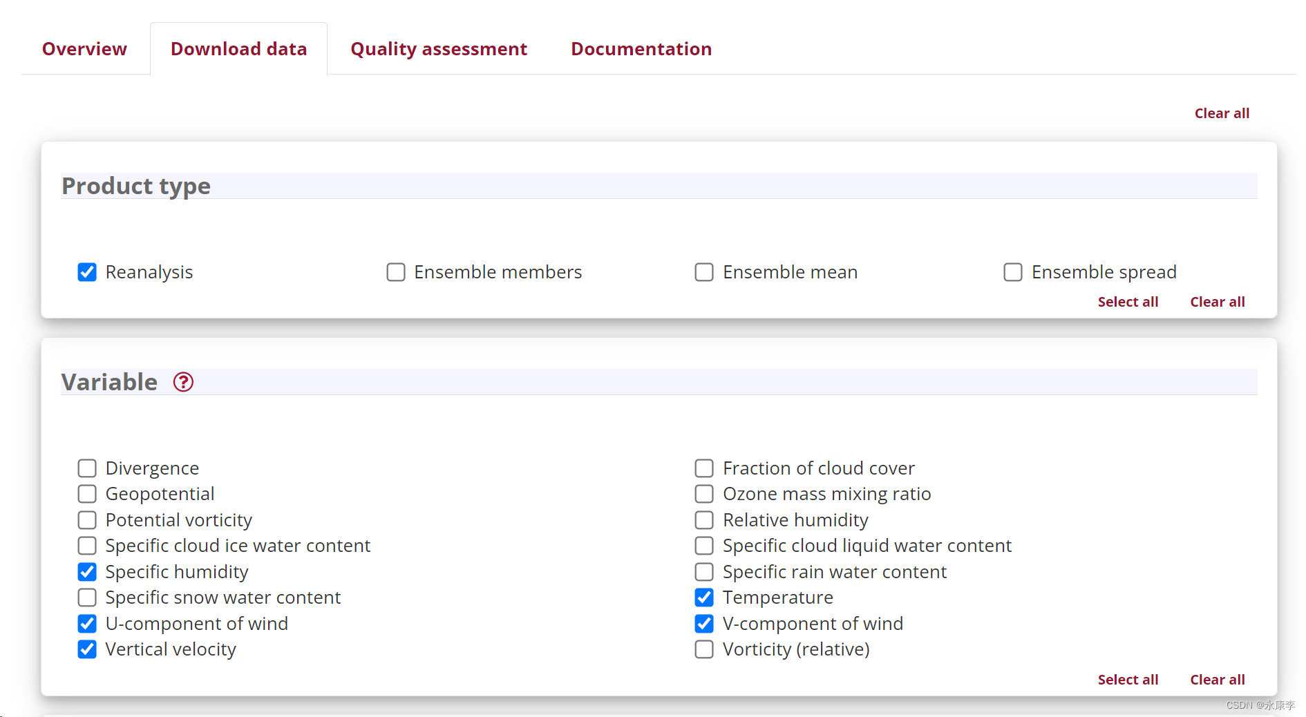
以下为我们数据介绍界面和需要下载的变量:
数据介绍地址:https://cds.climate.copernicus.eu/cdsapp#!/dataset/reanalysis-era5-pressure-levels?tab=overview
数据选择界面
代码
废话不多说,直接上代码。
导入包
import xarray as xr
import numpy as np
import matplotlib.pyplot as plt
import matplotlib
import geopandas as gpd
# 设置全局字体为新罗马
plt.rcParams['font.family'] = 'serif'
plt.rcParams['font.serif'] = ['Times New Roman']
# plt.rcParams['font.serif'] = ['SimSun']
# 设置全局字体权重为normal
plt.rcParams['font.weight'] = 'normal'
# 设置全局字体大小
matplotlib.rcParams['font.size'] = 19  # 设置全局字体大小为12
画水汽通量散度图
# 加载shapefile
gdf = gpd.read_file(r'./shp/Pronvience.shp')
# 使用geopandas读取地理数据,这里我们手动创建一个GeoDataFrame
gdf_point = gpd.GeoDataFrame({
'City': ['Mingfeng Station', 'Kalasai Station'],
'Latitude': [37.5,37],
'Longitude': [80,81]
}, geometry=gpd.points_from_xy([80,81], [37.5,37]))
# 载入数据
data_path = r'./20170731_case.nc' # 替换为您的文件路径
ds = xr.open_dataset(data_path)
time = '2017-07-30T22:00:00'
# level_hPa = 700
# for level_hPa in [200,500,700,850]:
for level_hPa in [600]:
# 选择特定时间和气压层
ds_selected = ds.sel(time= time, level=level_hPa) # 示例:2022年1月1日0时,850hPa
# 获取数据变量
u = ds_selected['u'] # 东西向风速
v = ds_selected['v'] # 南北向风速
q = ds_selected['q'] # 比湿
# 获取经度和纬度,假设这些是坐标维度
longitude = u.longitude
latitude = u.latitude
# 计算水汽通量
qu = q * u # 东西向水汽通量
qv = q * v # 南北向水汽通量
# 计算水汽通量散度 单位为
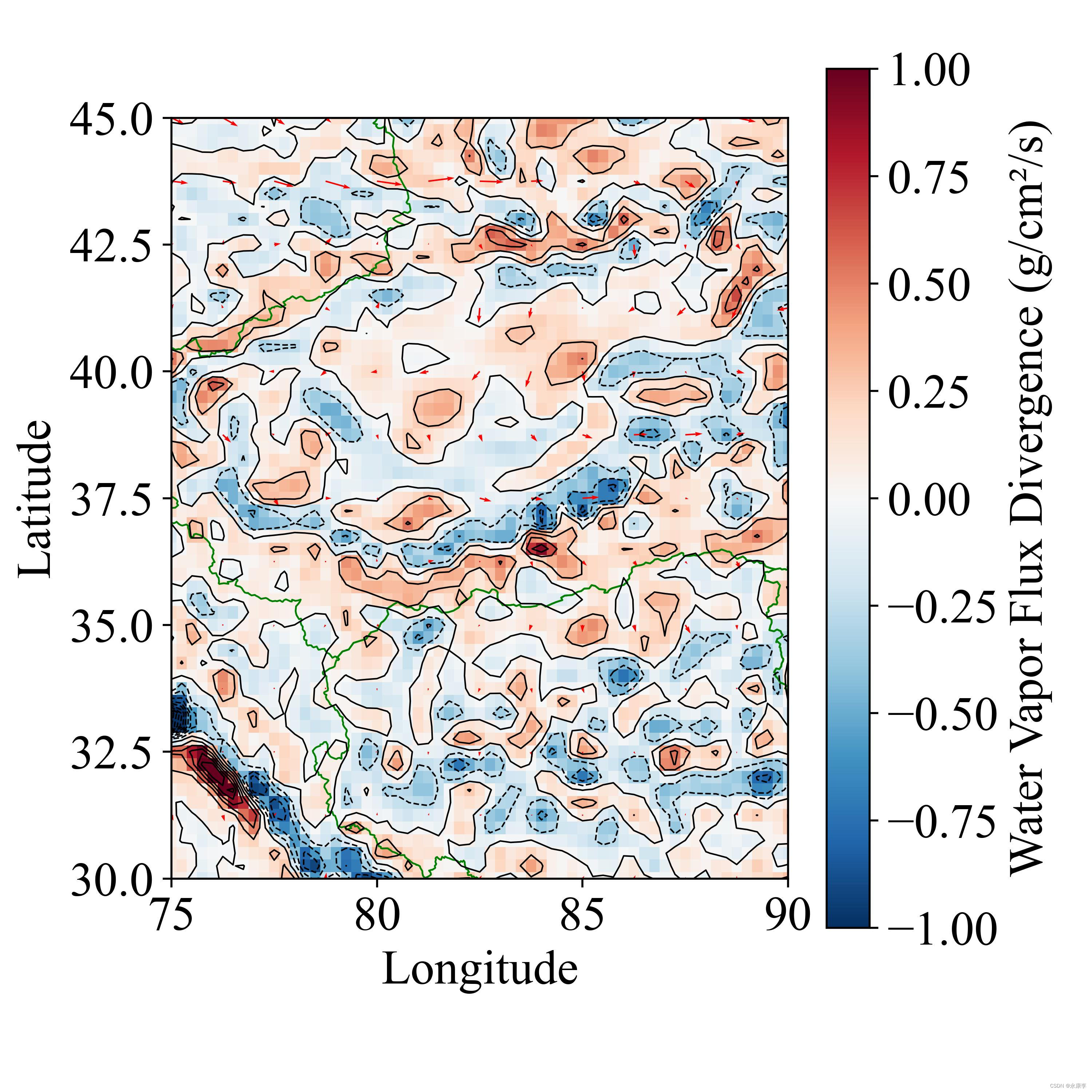
div_q = (qu.differentiate('longitude') + qv.differentiate('latitude'))* 10
# 打印结果
# print(div_q)
# 创建图形和轴对象
fig, ax = plt.subplots(figsize=(6, 6),dpi=500) # 图形尺寸为10x6英寸
# 可视化散度结果
contour = div_q.plot(add_colorbar=False, cmap="RdBu_r", vmin=-1, vmax=1) # 使用黑色线条绘制20个等级的等高线
#
# 在ax上绘制等高线图
div_q.plot.contour(levels=25, colors='black',linewidths=0.6)
# 添加颜色条
fig.colorbar(contour, ax=ax, label='Water Vapor Flux Divergence (g/cm²/s)')
# 使用quiver函数需要确保数据的间隔,这里我们每隔5个点取样
Q = ax.quiver(longitude[::5], latitude[::5], u[::5, ::5], v[::5, ::5], scale=300,color="red")
# 绘制shapefile
gdf.plot(ax=ax, color='none', edgecolor='green',linewidths=0.7) # 无填充,黑色边界
# gdf_point.plot(ax=ax, color='red') # 标记纽约的位置
# 绘制点
ax.scatter(gdf_point['Longitude'], gdf_point['Latitude'], color='red', s=100)
# 标注城市名称
for x, y, city in zip(gdf_point['Longitude'], gdf_point['Latitude'], gdf_point['City']):
ax.text(x, y, ' ' + city, verticalalignment='center', fontsize=15)
# 设置经纬度范围
ax.set_xlim(75, 90)
ax.set_ylim(30, 45)
ax.set_xlabel('Longitude')
ax.set_ylabel('Latitude')
ax.set_title('') # 清除标题
# 添加标题在图片正下方
# fig.suptitle('{}hPa {}'.format( level_hPa,time.replace("T"," ") ), y=-0.01,va='bottom')
# 调整布局以避免重叠和裁剪
fig.tight_layout()
plt.savefig("./{}hPa {}.jpg".format( level_hPa,time.replace(":","") ), dpi=500)
plt.show()
水汽通量图
# 加载shapefile
gdf = gpd.read_file(r'./shp/Pronvience.shp')
# 载入数据
data_path = r'./20170731_case.nc'  # 替换为您的文件路径
ds = xr.open_dataset(data_path)
time = '2017-07-30T22:00:00'
for level_hPa in [200,500,600,700,850]:
    # 选择特定时间和气压层
    ds_selected = ds.sel(time= time, level=level_hPa)  # 示例:2022年1月1日0时,850hPa

    # 获取数据变量
    u = ds_selected['u']  # 东西向风速
    v = ds_selected['v']  # 南北向风速
    q = ds_selected['q']  # 比湿

    # 获取经度和纬度,假设这些是坐标维度
    longitude = u.longitude
    latitude = u.latitude

    # 计算水汽通量
    qu = q * u * 100  # 东西向水汽通量
    qv = q * v * 100 # 南北向水汽通量

    wvf = np.sqrt(qu**2 + qv**2)

    # 计算水汽通量散度 单位为
    # div_q = (qu.differentiate('longitude') + qv.differentiate('latitude'))* 10

    # 打印结果
    # print(div_q)

    # 创建图形和轴对象
    fig, ax = plt.subplots(figsize=(6, 6),dpi=400)  # 图形尺寸为10x6英寸

    # 可视化散度结果
    contour = wvf.plot(add_colorbar=False, cmap="RdBu_r", vmin=0, vmax=10)  # 使用黑色线条绘制20个等级的等高线
    #
    # 在ax上绘制等高线图
    wvf.plot.contour(levels=25, colors='black',linewidths=0.6)
    # 添加颜色条
    fig.colorbar(contour, ax=ax, label='Water Vapor Flux(g/cm/s)')

    # 使用quiver函数需要确保数据的间隔,这里我们每隔5个点取样
    Q = ax.quiver(longitude[::5], latitude[::5], u[::5, ::5], v[::5, ::5], scale=300,color="red")

    # 绘制shapefile
    gdf.plot(ax=ax, color='none', edgecolor='green',linewidths=0.7)  # 无填充,黑色边界

    # 设置经纬度范围
    ax.set_xlim(75, 90)
    ax.set_ylim(30, 45)

    ax.set_xlabel('Longitude')
    ax.set_ylabel('Latitude')
    ax.set_title('')  # 清除标题

    # 添加标题在图片正下方
    # fig.suptitle('{}hPa {}'.format( level_hPa,time.replace("T"," ") ), y=-0.01,va='bottom')

    # 调整布局以避免重叠和裁剪
    fig.tight_layout()

    plt.savefig("./WVF_{}hPa {}.jpg".format( level_hPa,time.replace(":","") ), dpi=500)
    plt.show()
结果图
免责声明:我们致力于保护作者版权,注重分享,被刊用文章因无法核实真实出处,未能及时与作者取得联系,或有版权异议的,请联系管理员,我们会立即处理! 部分文章是来自自研大数据AI进行生成,内容摘自(百度百科,百度知道,头条百科,中国民法典,刑法,牛津词典,新华词典,汉语词典,国家院校,科普平台)等数据,内容仅供学习参考,不准确地方联系删除处理! 图片声明:本站部分配图来自人工智能系统AI生成,觅知网授权图片,PxHere摄影无版权图库和百度,360,搜狗等多加搜索引擎自动关键词搜索配图,如有侵权的图片,请第一时间联系我们,邮箱:ciyunidc@ciyunshuju.com。本站只作为美观性配图使用,无任何非法侵犯第三方意图,一切解释权归图片著作权方,本站不承担任何责任。如有恶意碰瓷者,必当奉陪到底严惩不贷!


