
前端学习<二>CSS基础——17-CSS3的常见边框汇总
CSS3 常见边框汇总
CSS3 边框
body, ul, li, dl, dt, dd, h1, h2, h3, h4, h5 {
margin: 0;
padding: 0;
}
body {
background-color: #F7F7F7;
}
.wrapper {
width: 1000px;
margin: 0 auto;
padding: 20px;
box-sizing: border-box;
}
header {
padding: 20px 0;
margin-bottom: 20px;
text-align: center;
}
header h3 {
line-height: 1;
font-weight: normal;
font-size: 28px;
}
.main {
/*overflow: hidden;*/
}
.main:after {
content: '';
clear: both;
display: block;
}
.main .item {
width: 210px;
height: 210px;
margin: 0 30px 30px 0;
display: flex;
position: relative;
background-color: #FFF;
float: left;
box-shadow: 2px 2px 5px #CCC;
}
.main .item:after {
content: attr(data-brief);
display: block;
width: 100%;
height: 100%;
text-align: center;
line-height: 210px;
position: absolute;
top: 0;
left: 0;
color: #FFF;
font-family: '微软雅黑';
font-size: 18px;
background-color: rgba(170, 170, 170, 0);
z-index: -1;
transition: all 0.3s ease-in;
}
.main .item:hover:after {
background-color: rgba(170, 170, 170, 0.6);
z-index: 100;
}
.main .item:nth-child(4n) {
margin-right: 0;
}
/*.main .item:nth-last-child(-n+5) {
margin-bottom: 0;
}*/
/* 以上是骨架样式 */
/* 1、2、3、4 顺时针 */
.border-radius {
width: 180px;
height: 180px;
margin: auto;
border: 1px solid red;
/*border-radius: 50% 30% 20%;*/
}
.square {
border-radius: 0;
}
/*拱形*/
.item:nth-child(1) .border-radius {
border-radius: 90px;
}
/*拱形*/
.item:nth-child(2) .border-radius {
border-radius: 90px 90px 0 0;
}
/*半圆*/
.item:nth-child(3) .border-radius {
height: 90px;
border-radius: 90px 90px 0 0;
}
/*左上角*/
.item:nth-child(4) .border-radius {
/*height: 90px;*/
border-radius: 90px 0 0 0;
}
/*四分之一圆*/
.item:nth-child(5) .border-radius {
width: 90px;
height: 90px;
border-radius: 90px 0 0 0;
}
/*横着的椭圆*/
.item:nth-child(6) .border-radius {
height: 90px;
/*border-radius: 50%;*/
border-radius: 90px 90px 90px 90px / 45px 45px 45px 45px;
/*border-radius: 45px / 90px;*/
}
/*竖着的椭圆*/
.item:nth-child(7) .border-radius {
width: 90px;
border-radius: 45px 45px 45px 45px / 90px 90px 90px 90px;
}
/*半个横着的椭圆*/
.item:nth-child(8) .border-radius {
height: 45px;
border-radius: 90px 90px 0 0 / 45px 45px 0 0;
}
/*半个竖着的椭圆*/
.item:nth-child(9) .border-radius {
width: 45px;
border-radius: 45px 0 0 45px / 90px 0 0 90px;
}
/*四分之一竖着的椭圆*/
.item:nth-child(10) .border-radius {
width: 45px;
height: 90px;
border-radius: 45px 0 0 0 / 90px 0 0 0;
}
/*饼环*/
.item:nth-child(11) .border-radius {
width: 40px;
height: 40px;
border: 70px solid red;
border-radius: 90px;
}
/*圆饼*/
.item:nth-child(12) .border-radius {
width: 40px;
height: 40px;
border: 70px solid red;
border-radius: 60px;
}
/*左上角圆饼*/
.item:nth-child(13) .border-radius {
width: 60px;
height: 60px;
border: 60px solid red;
border-radius: 90px 0 0 0;
}
/*对角圆饼*/
.item:nth-child(14) .border-radius {
width: 60px;
height: 60px;
border: 60px solid red;
border-radius: 90px 0 90px 0;
}
/*四边不同色*/
.item:nth-child(15) .border-radius {
width: 0px;
height: 0px;
border-width: 90px;
border-style: solid;
border-color: red green yellow blue;
}
/*右透明色*/
.item:nth-child(16) .border-radius {
width: 0px;
height: 0px;
border-width: 90px;
border-style: solid;
border-color: red green yellow blue;
border-right-color: transparent;
}
/*圆右透明色*/
.item:nth-child(17) .border-radius {
width: 0px;
height: 0px;
border-width: 90px;
border-style: solid;
border-color: red;
border-right-color: transparent;
border-radius: 90px;
}
/*圆右红透明色*/
.item:nth-child(18) .border-radius {
width: 0px;
height: 0px;
border-width: 90px;
border-style: solid;
border-color: transparent;
border-right-color: red;
border-radius: 90px;
}
/*阴阳图前世*/
.item:nth-child(19) .border-radius {
width: 180px;
height: 0px;
border-top-width: 90px;
border-bottom-width: 90px;
border-style: solid;
border-top-color: red;
border-bottom-color: green;
/*border-right-color: red;*/
border-radius: 90px;
}
/*阴阳图前世2*/
.item:nth-child(20) .border-radius {
width: 180px;
height: 90px;
border-bottom-width: 90px;
border-style: solid;
border-bottom-color: green;
background-color: red;
/*border-right-color: red;*/
border-radius: 90px;
}
/*阴阳图今生*/
.item:nth-child(21) .border-radius {
width: 180px;
height: 90px;
border-bottom-width: 90px;
border-style: solid;
border-bottom-color: green;
background-color: red;
border-radius: 90px;
position: relative;
}
.item:nth-child(21) .border-radius::after,
.item:nth-child(21) .border-radius::before {
content: '';
position: absolute;
top: 50%;
width: 20px;
height: 20px;
/*margin: -10px 0 0 0;*/
border-width: 35px;
border-style: solid;
border-radius: 45px;
}
/*左阴阳*/
.item:nth-child(21) .border-radius::after {
background-color: red;
border-color: green;
}
/*右阴阳*/
.item:nth-child(21) .border-radius::before {
background-color: green;
border-color: red;
right: 0;
}
/*右阴阳*/
.item:nth-child(22) .border-radius {
width: 180px;
height: 90px;
border-bottom-width: 90px;
border-bottom-color: green;
border-bottom-style: solid;
background-color: red;
border-radius: 90px;
position: relative;
}
.item:nth-child(22) .border-radius::after,
.item:nth-child(22) .border-radius::before {
content: '';
position: absolute;
top: 50%;
width: 20px;
height: 20px;
border-width: 35px;
border-style: solid;
border-radius: 45px;
}
.item:nth-child(22) .border-radius::before {
border-color: green;
background-color: red;
}
.item:nth-child(22) .border-radius::after {
right: 0;
border-color: red;
background-color: green;
}
/*消息框*/
.item:nth-child(23) .border-radius {
width: 160px;
height: 80px;
background-color: red;
border-radius: 6px;
position: relative;
}
.item:nth-child(23) .border-radius::after {
content: '';
width: 0;
height: 0;
border-width: 10px;
border-style: solid;
border-color: transparent;
border-right-color: red;
position: absolute;
top: 16px;
left: -20px;
}
/*奇怪的图形*/
.item:nth-child(24) .border-radius {
width: 40px;
height: 40px;
border-width: 45px 0 45px 70px;
border-style: solid;
border-radius: 0 0 60px 0;
border-color: red;
}
/*奇怪的图形2*/
.item:nth-child(25) .border-radius {
width: 100px;
height: 40px;
border-width: 45px 20px 45px 70px;
border-style: solid;
border-radius: 60px;
border-color: red;
}
/*QQ对话*/
.item:nth-child(26) .border-radius {
width: 160px;
height: 80px;
background-color: red;
border-radius: 6px;
position: relative;
}
.item:nth-child(26) .border-radius::after {
content: '';
position: absolute;
top: 0;
right: -20px;
width: 30px;
height: 30px;
border-width: 0 0 30px 30px;
border-style: solid;
border-bottom-color: red;
border-left-color: transparent;
border-radius: 0 0 60px 0;
}
/*圆角的百分比设置 */
.item:nth-child(27) .border-radius {
width: 180px;
/*height: 180px;*/
height: 90px;
border-radius: 50%;
border-radius: 90px/45px;
/*百分比是按横竖两个对应的方向的长度进行计算*/
}
CSS3 边框圆角
效果如下:

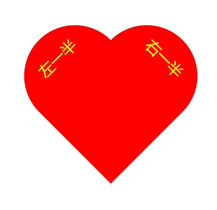
爱心
.heart {
width: 200px;
height: 300px;
/*border: 1px solid #000;*/
margin: 100px auto;
position: relative;
}
.heart::before, .heart::after {
content: "左一半";
width: 100%;
height: 100%;
position: absolute;
background-color: red;
left: 0;
top: 0;
border-radius: 100px 100px 0 0;
transform: rotate(-45deg);
text-align: center;
line-height: 100px;
color: yellow;
font-size: 30px;
font-family: "MIcrosoft Yahei";
}
.heart::after {
content: "右一半";
left: 71px;
transform: rotate(45deg);
}
效果如下:
它其实是下面这两个盒子叠起来的:
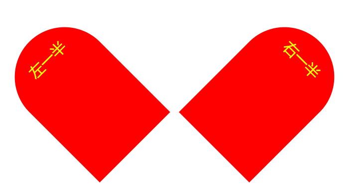
改变 .heart::after 的 left值,即可叠起来。
免责声明:我们致力于保护作者版权,注重分享,被刊用文章因无法核实真实出处,未能及时与作者取得联系,或有版权异议的,请联系管理员,我们会立即处理! 部分文章是来自自研大数据AI进行生成,内容摘自(百度百科,百度知道,头条百科,中国民法典,刑法,牛津词典,新华词典,汉语词典,国家院校,科普平台)等数据,内容仅供学习参考,不准确地方联系删除处理! 图片声明:本站部分配图来自人工智能系统AI生成,觅知网授权图片,PxHere摄影无版权图库和百度,360,搜狗等多加搜索引擎自动关键词搜索配图,如有侵权的图片,请第一时间联系我们,邮箱:ciyunidc@ciyunshuju.com。本站只作为美观性配图使用,无任何非法侵犯第三方意图,一切解释权归图片著作权方,本站不承担任何责任。如有恶意碰瓷者,必当奉陪到底严惩不贷!


