
用HTML语言制作一个非常浪漫的生日祝福网,手把手教你制作炫酷生日祝福网页
温馨提示:这篇文章已超过438天没有更新,请注意相关的内容是否还可用!
一、📚网页介绍
明天就是女朋友的生日了, 是时候展现专属于程序员的浪漫了!你打算怎么给心爱的人表达爱意?鲜花礼物?代码表白?还是创意DIY?或者…无论那种形式,快来秀我们一脸吧!
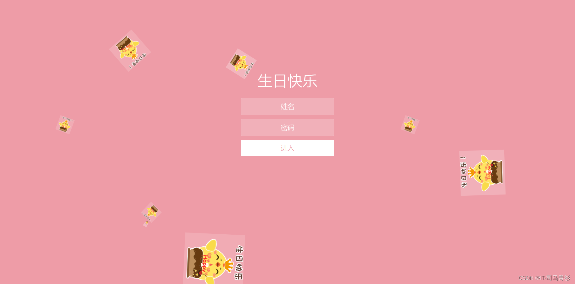
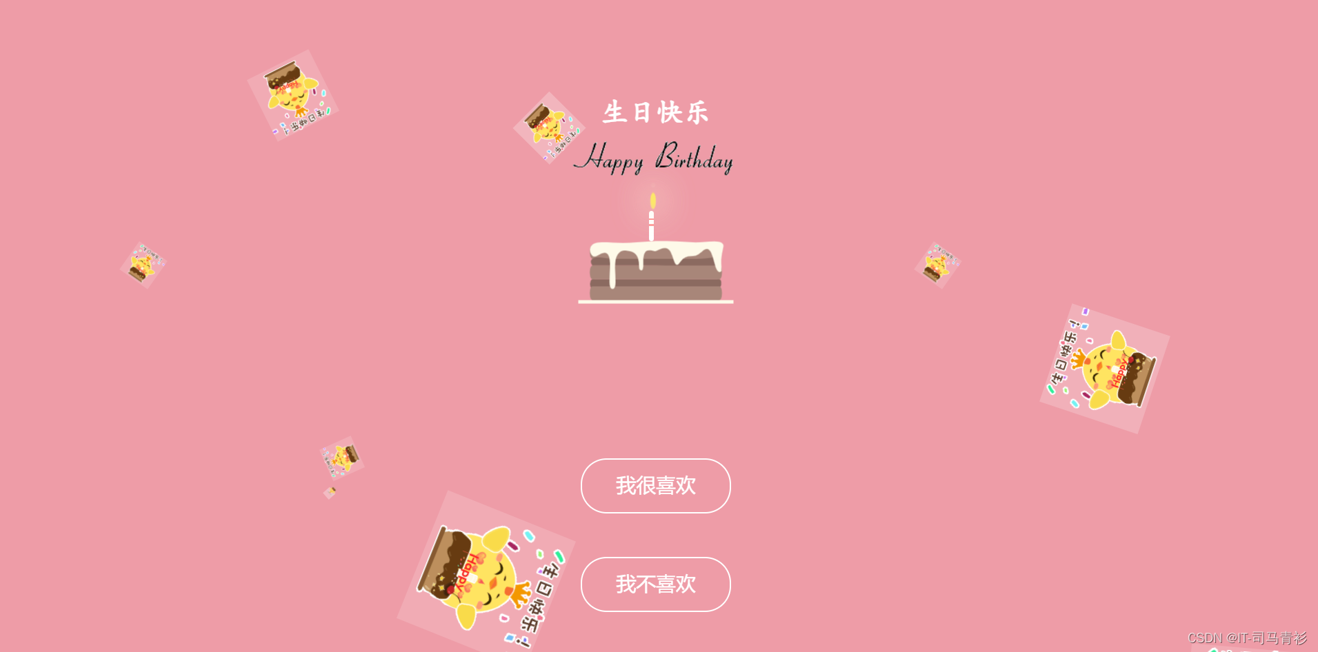
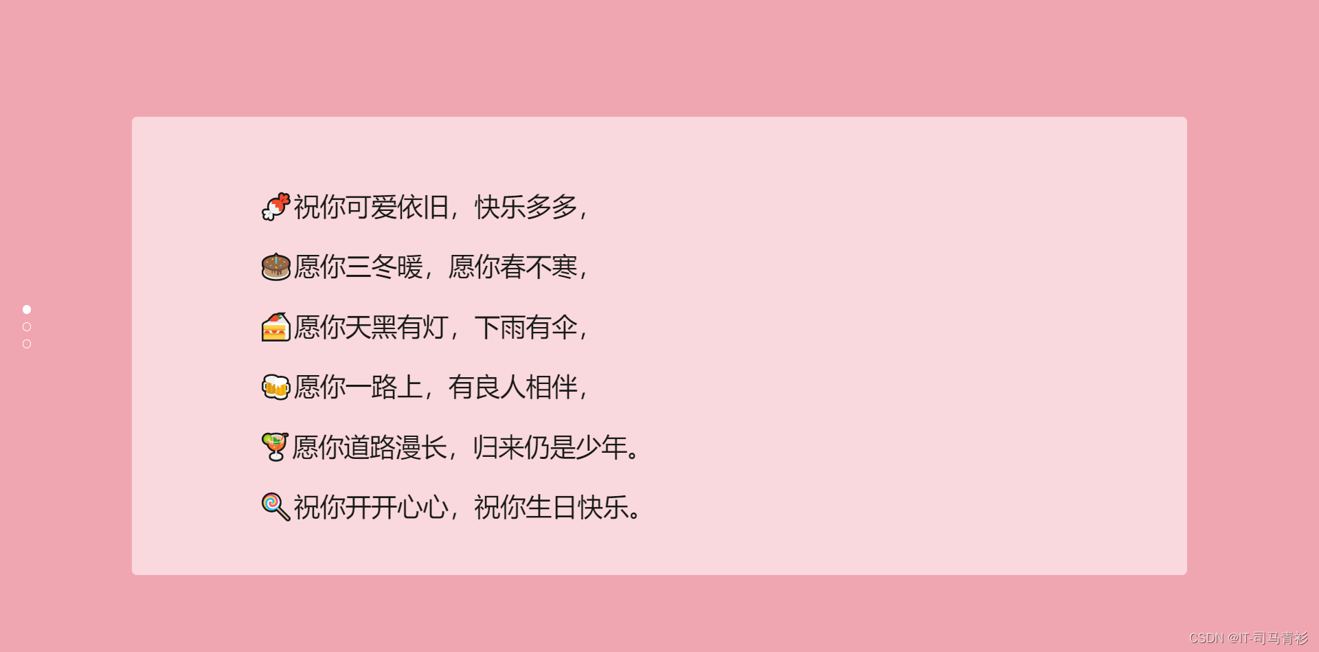
二、🎀网页效果
▶️视频演示
HTML生日祝福网页制作(粉色主题)程序员专属生日表白网站
🌈图片演示


三、🏙️网页代码
💬注:以下代码为部分演示,如需完整源码请看文章末尾
🧱HTML代码
    生日快乐


          生日快乐


            进入
-

-
-
-
-
-
-
-
-
-
❄️CSS代码
* {
  box-sizing: border-box;
  margin: 0;
  padding: 0;
  font-weight: 300;
}
body {
  font-family:"Microsoft YaHei";
  color: white;
  font-weight: 300;
}
body ::-webkit-input-placeholder {
  /* WebKit browsers */
  font-family:"Microsoft YaHei";
  color: white;
  font-weight: 300;
}
body :-moz-placeholder {
  /* Mozilla Firefox 4 to 18 */
  font-family:"Microsoft YaHei";
  color: white;
  opacity: 1;
  font-weight: 300;
}
body ::-moz-placeholder {
  /* Mozilla Firefox 19+ */
  font-family:"Microsoft YaHei";
  color: white;
  opacity: 1;
  font-weight: 300;
}
body :-ms-input-placeholder {
  /* Internet Explorer 10+ */
  font-family:"Microsoft YaHei";
  color: white;
  font-weight: 300;
}
.wrapper {
  background: #ee9ca7;
  background: -webkit-linear-gradient(top left, #ee9ca7 0%, #ee9ca7 100%);
  background: linear-gradient(to bottom right, #ee9ca7 0%, #ee9ca7 100%);
  background-color:rgba(255,255,255,0.9);
  position: absolute;
  top:0;
  left: 0;
  width: 100%;
  height: 100%;
  overflow: hidden;
}
.wrapper.form-success .container h1 {
  -webkit-transform: translateY(85px);
      -ms-transform: translateY(85px);
          transform: translateY(85px);
}
.container {
  max-width: 600px;
  margin: 0 auto;
  margin-top: 7%;
  padding: 80px 0;
  height: 400px;
  text-align: center;
}
.container h1 {
  font-size: 40px;
  -webkit-transition-duration: 1s;
          transition-duration: 1s;
  -webkit-transition-timing-function: ease-in-put;
          transition-timing-function: ease-in-put;
  font-weight: 200;
}
form {
  padding: 20px 0;
  position: relative;
  z-index: 2;
}
form input {
  -webkit-appearance: none;
     -moz-appearance: none;
          appearance: none;
  outline: 0;
  border: 1px solid rgba(255, 255, 255, 0.4);
  background-color: rgba(255, 255, 255, 0.2);
  width: 250px;
  border-radius: 3px;
  padding: 10px 15px;
  margin: 0 auto 10px auto;
  display: block;
  text-align: center;
  font-family: "Microsoft YaHei";
  font-size: 18px;
  color: white;
  -webkit-transition-duration: 0.25s;
          transition-duration: 0.25s;
  font-weight: 300;
}
form input:hover {
  background-color: rgba(255, 255, 255, 0.4);
}
form input:focus {
  background-color: white;
  width: 300px;
  color: #ee9ca7;
}
form button {
  -webkit-appearance: none;
     -moz-appearance: none;
          appearance: none;
  outline: 0;
  background-color: white;
  font-family: "Microsoft YaHei";
  border: 0;
  padding: 10px 15px;
  color: #ee9ca7;
  border-radius: 3px;
  width: 250px;
  cursor: pointer;
  font-size: 18px;
  -webkit-transition-duration: 0.25s;
          transition-duration: 0.25s;
}
form button:hover {
  background-color: #f5f7f9;
}
.bg-bubbles {
  position: absolute;
  top: 0;
  left: 0;
  width: 100%;
  height: 100%;
  z-index: 1;
}
@keyframes square {
  0% {
    -webkit-transform: translateY(0);
            transform: translateY(0);
  }
  100% {
    -webkit-transform: translateY(-900px) rotate(600deg);
            transform: translateY(-900px) rotate(600deg);
  }
}
四、🎁获取源码
1.如果我的博客对你有帮助 请 “👍点赞” “✍️评论” “💙收藏” 一键三连哦!
2.💗【👇🏻👇🏻👇🏻🉑关注我| 获取更多源码】 带您学习各种前端插件、3D炫酷效果、图片展示、文字效果、以及整站模板 、大学生毕业HTML模板 、等!
📣以上内容技术相关问题💌欢迎一起交流学习👇🏻👇🏻👇🏻
免责声明:我们致力于保护作者版权,注重分享,被刊用文章因无法核实真实出处,未能及时与作者取得联系,或有版权异议的,请联系管理员,我们会立即处理! 部分文章是来自自研大数据AI进行生成,内容摘自(百度百科,百度知道,头条百科,中国民法典,刑法,牛津词典,新华词典,汉语词典,国家院校,科普平台)等数据,内容仅供学习参考,不准确地方联系删除处理! 图片声明:本站部分配图来自人工智能系统AI生成,觅知网授权图片,PxHere摄影无版权图库和百度,360,搜狗等多加搜索引擎自动关键词搜索配图,如有侵权的图片,请第一时间联系我们,邮箱:ciyunidc@ciyunshuju.com。本站只作为美观性配图使用,无任何非法侵犯第三方意图,一切解释权归图片著作权方,本站不承担任何责任。如有恶意碰瓷者,必当奉陪到底严惩不贷!


