2024年HarmonyOS鸿蒙最全鸿蒙HarmonyOS实战-ArkUI组件(GridRow GridCol)


深知大多数程序员,想要提升技能,往往是自己摸索成长,但自己不成体系的自学效果低效又漫长,而且极易碰到天花板技术停滞不前!
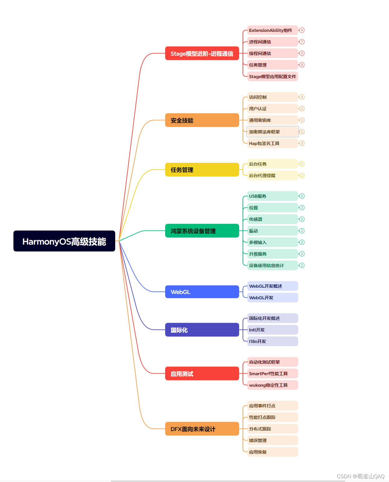

既有适合小白学习的零基础资料,也有适合3年以上经验的小伙伴深入学习提升的进阶课程,涵盖了95%以上鸿蒙开发知识点,真正体系化!
由于文件比较多,这里只是将部分目录截图出来,全套包含大厂面经、学习笔记、源码讲义、实战项目、大纲路线、讲解视频,并且后续会持续更新
需要这份系统化的资料的朋友,可以戳这里获取
})
}
}
}

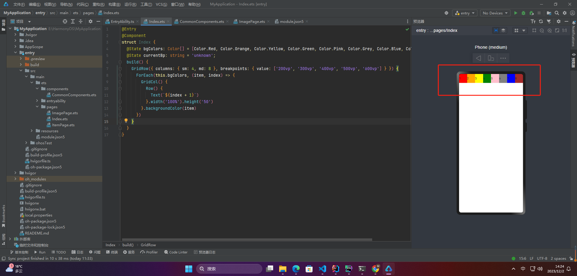
2、设置列数
当columns为自定义值,栅格布局在任何尺寸设备下都被分为columns列。
@Entry
@Component
struct Index {
@State bgColors: Color[] = [Color.Red, Color.Orange, Color.Yellow, Color.Green, Color.Pink, Color.Grey, Color.Blue, Color.Brown];
@State currentBp: string = ‘unknown’;
build() {
Row() {
GridRow({ columns: 4 }) {
ForEach(this.bgColors, (item, index) => {
GridCol() {
Row() {
Text(${index + 1})
}.width(‘100%’).height(‘50’)
}.backgroundColor(item)
})
}
.width(‘100%’).height(‘100%’)
.onBreakpointChange((breakpoint) => {
this.currentBp = breakpoint
})
}
.height(160)
.border({ color: Color.Blue, width: 2 })
.width(‘100%’)
}
}

3、公用
@Entry
@Component
struct Index {
@State bgColors: Color[] = [Color.Red, Color.Orange, Color.Yellow, Color.Green, Color.Pink, Color.Grey, Color.Blue, Color.Brown];
@State currentBp: string = ‘unknown’;
build() {
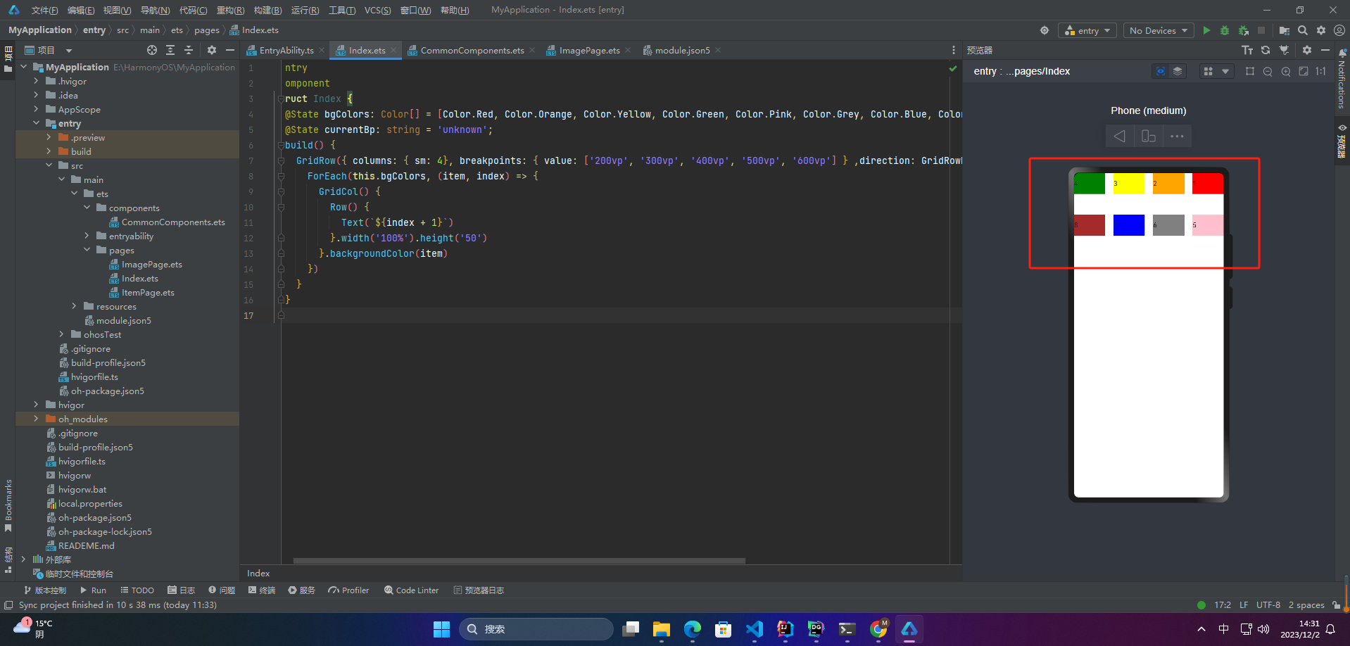
GridRow({ columns: { sm: 4, md: 8 }, breakpoints: { value: [‘200vp’, ‘300vp’, ‘400vp’, ‘500vp’, ‘600vp’] } }) {
ForEach(this.bgColors, (item, index) => {
GridCol() {
Row() {
Text(${index + 1})
}.width(‘100%’).height(‘50’)
}.backgroundColor(item)
})
}
}
}
若只设置sm, md的栅格总列数,则较小的尺寸使用默认columns值12,较大的尺寸使用前一个尺寸的columns。这里只设置sm:4, md:8,则较小尺寸的xs:12,较大尺寸的参照md的设置,lg:8, xl:8, xxl:8。
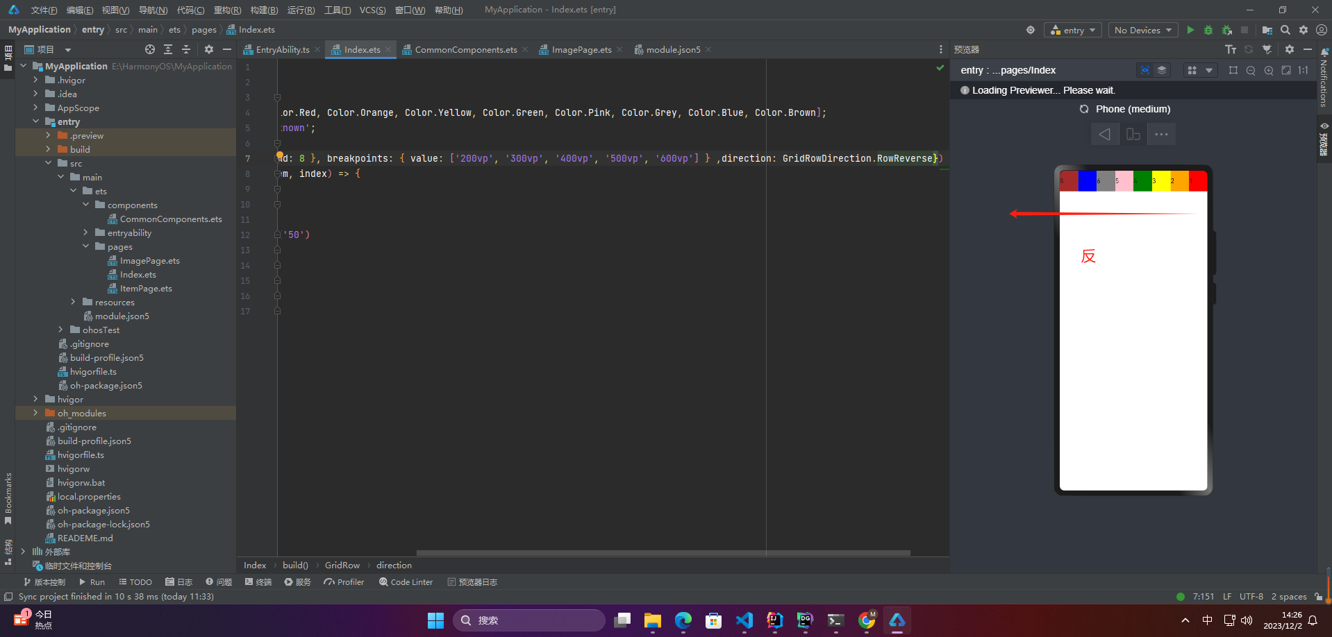
2.3 排列方向
可以通过设置GridRow的direction属性来指定栅格子组件在栅格容器中的排列方向。
该属性可以设置为
- GridRowDirection.Row(从左往右排列)
- GridRowDirection.RowReverse(从右往左排列)
@Entry
@Component
struct Index {
@State bgColors: Color[] = [Color.Red, Color.Orange, Color.Yellow, Color.Green, Color.Pink, Color.Grey, Color.Blue, Color.Brown];
@State currentBp: string = ‘unknown’;
build() {
GridRow({ columns: { sm: 4, md: 8 }, breakpoints: { value: [‘200vp’, ‘300vp’, ‘400vp’, ‘500vp’, ‘600vp’] } ,direction: GridRowDirection.RowReverse}) {
ForEach(this.bgColors, (item, index) => {
GridCol() {
Row() {
Text(${index + 1})
}.width(‘100%’).height(‘50’)
}.backgroundColor(item)
})
}
}
}
2.4 子组件间距
可以通过设置GridRow的gutter属性来指定栅格子组件在栅格容器中的排列方向。
该属性可以设置为
- 单个值GridRow({ gutter: 10 }){}(X:10,Y:10)
- 多个值GridRow({ gutter: { x: 20, y: 50 } }){}(X:20,Y:50)
@Entry
@Component
struct Index {
@State bgColors: Color[] = [Color.Red, Color.Orange, Color.Yellow, Color.Green, Color.Pink, Color.Grey, Color.Blue, Color.Brown];
@State currentBp: string = ‘unknown’;
build() {
GridRow({ columns: { sm: 4}, breakpoints: { value: [‘200vp’, ‘300vp’, ‘400vp’, ‘500vp’, ‘600vp’] } ,direction: GridRowDirection.RowReverse,gutter: { x: 20, y: 50 }}) {
ForEach(this.bgColors, (item, index) => {
GridCol() {
Row() {
Text(${index + 1})
}.width(‘100%’).height(‘50’)
}.backgroundColor(item)
})
}
}
}
3.子组件GridCol
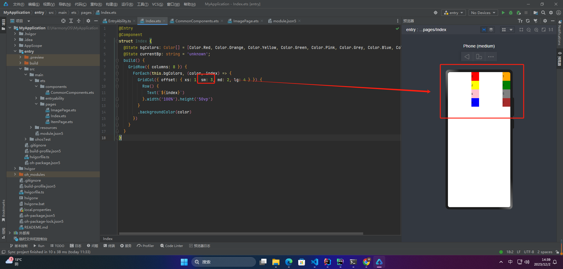
GridCol组件作为GridRow组件的子组件,通过给GridCol传参或者设置属性两种方式,设置span(占用列数),offset(偏移列数),order(元素序号)的值。
设置span。
GridCol({ span: 2 }){}
GridCol({ span: { xs: 1, sm: 2, md: 3, lg: 4 } }){}
GridCol(){}.span(2)
GridCol(){}.span({ xs: 1, sm: 2, md: 3, lg: 4 })
设置offset。
GridCol({ offset: 2 }){}
GridCol({ offset: { xs: 2, sm: 2, md: 2, lg: 2 } }){}
GridCol(){}.offset(2)
GridCol(){}.offset({ xs: 1, sm: 2, md: 3, lg: 4 })
设置order。
GridCol({ order: 2 }){}
GridCol({ order: { xs: 1, sm: 2, md: 3, lg: 4 } }){}
GridCol(){}.order(2)
GridCol(){}.order({ xs: 1, sm: 2, md: 3, lg: 4 })
3.1 span
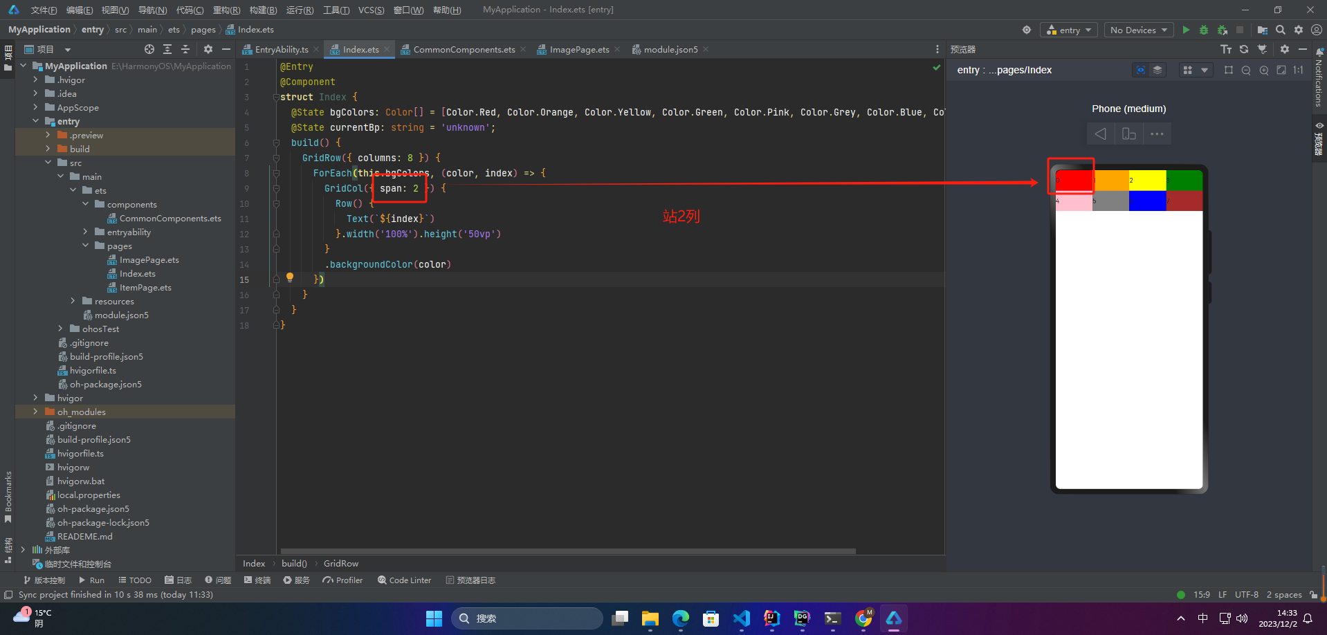
在栅格布局中,span属性表示某个元素或组件应该跨越的列数。例如,如果我们有一个包含12个列的栅格系统,我们可以使用span属性来指定一个元素应该占用多少列。
例如,如果我们希望一个元素占用3列,我们可以使用{ span: 3 },这将使元素跨越3列。同样,如果我们希望元素跨越整个栅格系统,我们可以使用{ span: 12 }。
在具体的代码实现中,不同的栅格系统可能会使用不同的方式实现span属性,但通常都会提供类似于{ span: 3 }的语法来指定元素所占据的列数。
1、当类型为number时,子组件在所有尺寸设备下占用的列数相同。
@Entry
@Component
struct Index {
@State bgColors: Color[] = [Color.Red, Color.Orange, Color.Yellow, Color.Green, Color.Pink, Color.Grey, Color.Blue, Color.Brown];
@State currentBp: string = ‘unknown’;
build() {
GridRow({ columns: 8 }) {
ForEach(this.bgColors, (color, index) => {
GridCol({ span: 2 }) {
Row() {
Text(${index})
}.width(‘100%’).height(‘50vp’)
}
.backgroundColor(color)
})
}
}
}
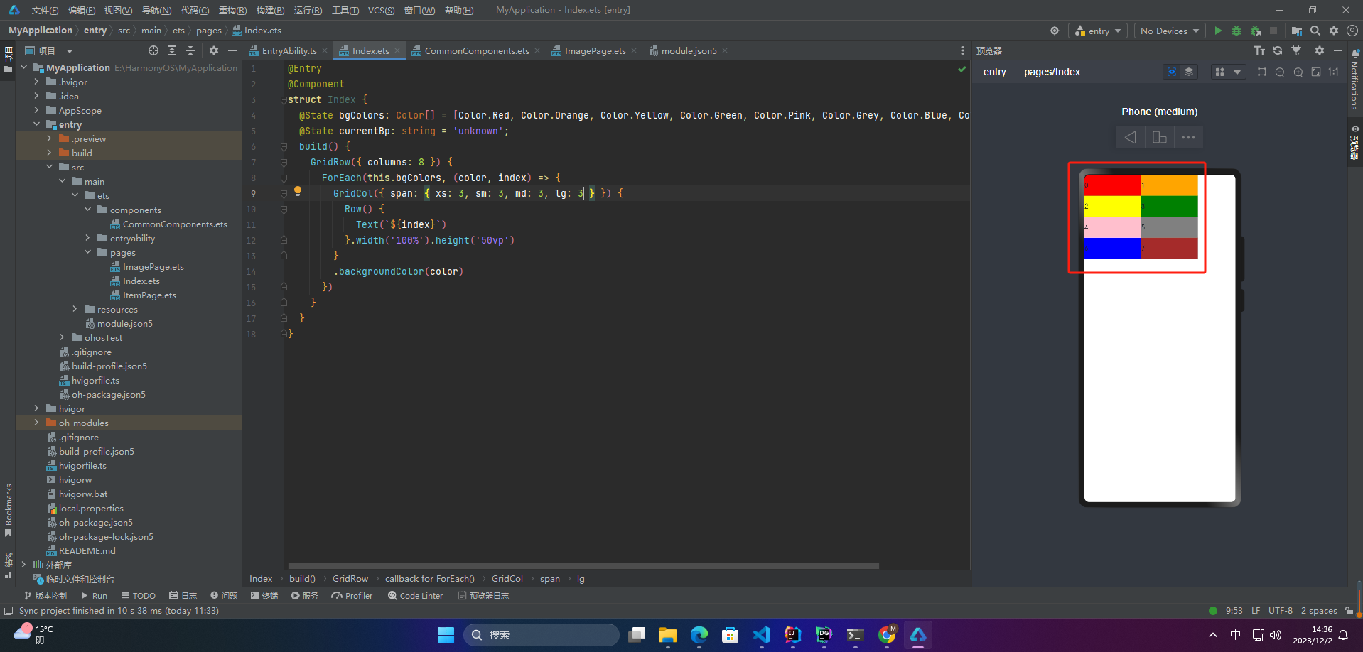
2、当类型为GridColColumnOption时,支持六种不同尺寸(xs, sm, md, lg, xl, xxl)设备中子组件所占列数设置,各个尺寸下数值可不同。
@State bgColors: Color[] = [Color.Red, Color.Orange, Color.Yellow, Color.Green, Color.Pink, Color.Grey, Color.Blue, Color.Brown];
…
GridRow({ columns: 8 }) {
ForEach(this.bgColors, (color, index) => {
GridCol({ span: { xs: 3, sm: 3, md: 3, lg: 3 } }) {
Row() {
Text(${index})
}.width(‘100%’).height(‘50vp’)
}
.backgroundColor(color)
})
}
3.2 offset
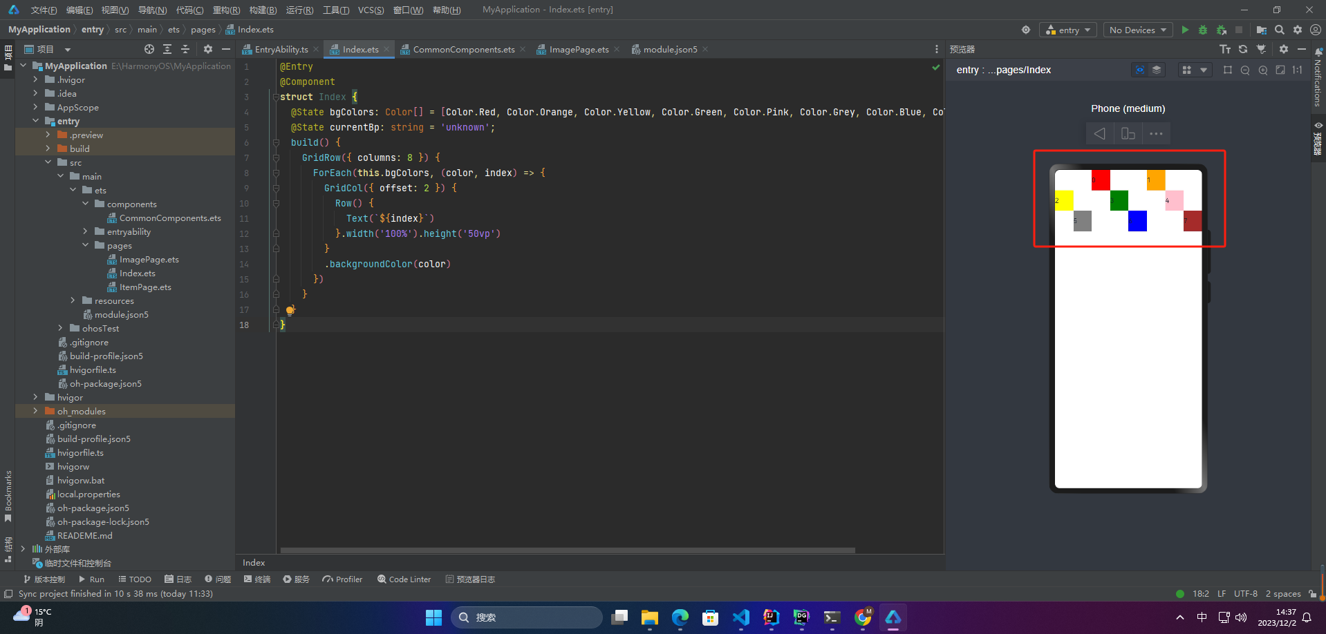
栅格布局的offset是指在栅格布局中,元素相对于其父元素的偏移量。使用offset可以将元素移动到栅格中的任意位置。在栅格布局中,通常使用偏移量来实现布局的灵活和自适应性。具体的偏移量取决于栅格的列数和元素所占的列数。通常,一般情况下,偏移量是通过给元素添加相应的类来实现的,例如:{ offset: 3 }表示元素在中等屏幕上向右偏移3个栅格。
1、当类型为number时,子组件偏移相同列数
@Entry
@Component
struct Index {
@State bgColors: Color[] = [Color.Red, Color.Orange, Color.Yellow, Color.Green, Color.Pink, Color.Grey, Color.Blue, Color.Brown];
@State currentBp: string = ‘unknown’;
build() {
GridRow({ columns: 8 }) {
ForEach(this.bgColors, (color, index) => {
GridCol({ offset: 2 }) {
Row() {
Text(${index})
}.width(‘100%’).height(‘50vp’)
}
.backgroundColor(color)
})
}
}
}
2、当类型为GridColColumnOption时,支持六种不同尺寸(xs, sm, md, lg, xl, xxl)设备中子组件所占列数设置,各个尺寸下数值可不同
@Entry
@Component
struct Index {
@State bgColors: Color[] = [Color.Red, Color.Orange, Color.Yellow, Color.Green, Color.Pink, Color.Grey, Color.Blue, Color.Brown];
@State currentBp: string = ‘unknown’;
build() {
GridRow({ columns: 8 }) {
ForEach(this.bgColors, (color, index) => {
GridCol({ offset: { xs: 1, sm: 3, md: 2, lg: 4 } }) {
Row() {
Text(${index})
}.width(‘100%’).height(‘50vp’)
}
.backgroundColor(color)
})
}
}
}
3.3 order
栅格布局中,order属性用于指定网格项的显示顺序。默认情况下,网格项的显示顺序是按照它们在 HTML 代码中出现的顺序进行排列。通过设置 order 属性,可以改变网格项的显示顺序。
order 属性的值是一个整数,表示网格项的显示顺序。值越小的网格项越先显示,值相同的网格项按照它们在 HTML 代码中的顺序进行排列。若未设置该属性,则默认值为 0。
1、当类型为number时,子组件在任何尺寸下排序次序一致。
@Entry
@Component
struct Index {
@State bgColors: Color[] = [Color.Red, Color.Orange, Color.Yellow, Color.Green, Color.Pink, Color.Grey, Color.Blue, Color.Brown];
@State currentBp: string = ‘unknown’;
build() {
GridRow() {
GridCol({ order: 4 }) {
Row() {
Text(‘1’)
}.width(‘100%’).height(‘50vp’)
}.backgroundColor(Color.Red)
GridCol({ order: 3 }) {
Row() {
Text(‘2’)
}.width(‘100%’).height(‘50vp’)
}.backgroundColor(Color.Orange)
GridCol({ order: 2 }) {
Row() {

网上学习资料一大堆,但如果学到的知识不成体系,遇到问题时只是浅尝辄止,不再深入研究,那么很难做到真正的技术提升。
需要这份系统化的资料的朋友,可以戳这里获取
一个人可以走的很快,但一群人才能走的更远!不论你是正从事IT行业的老鸟或是对IT行业感兴趣的新人,都欢迎加入我们的的圈子(技术交流、学习资源、职场吐槽、大厂内推、面试辅导),让我们一起学习成长!
olor.Orange)
GridCol({ order: 2 }) {
Row() {
[外链图片转存中…(img-tLcDitsI-1715624420573)]
[外链图片转存中…(img-EWlNkykr-1715624420573)]
网上学习资料一大堆,但如果学到的知识不成体系,遇到问题时只是浅尝辄止,不再深入研究,那么很难做到真正的技术提升。
需要这份系统化的资料的朋友,可以戳这里获取
一个人可以走的很快,但一群人才能走的更远!不论你是正从事IT行业的老鸟或是对IT行业感兴趣的新人,都欢迎加入我们的的圈子(技术交流、学习资源、职场吐槽、大厂内推、面试辅导),让我们一起学习成长!