
【uniapp】开发微信小程序自定义底部tabbar
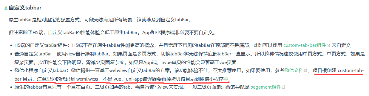
自定义tabBar的性能体验会低于原生tabBar,小程序端非必要不要自定义。但原生tabBar是相对固定的配置方式,可能无法满足所有场景,这就涉及到自定义tabBar。
一、使用流程
1、配置信息
在 pages.json 中的 tabBar 项指定 custom 字段,同时其余 tabBar 相关配置也补充完整
"tabBar": {
    "color": "#ffffff",
	"selectedColor": "#6777FD",
	"custom": true,
	"list": [{},{},{}]
}
2、添加tabBar代码文件
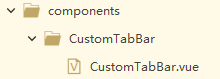
①自定义公共组件
在components目录下新建组件页面CustomTabBar,在CustomTabBar.vue中开发自定义组件
export default {
	props: {
		selected: Number
	},
	data() {
		return {
			color: "#fff",
			selectedColor: "#6777FD",
			list: [{},{},{}]
		}
	},
	methods: {
		switchTab(url) {
			uni.switchTab({
				url
			})
		}
	}
}
在需要用到tabBar的页面引入注册并使用组件,通过父子组件通信的方式传参当前是哪个索引页面selected,在子组件通过props接收并使用
	import CustomTabBar from "@/components/CustomTabBar/CustomTabBar.vue"
	export default {
		components: {
			CustomTabBar
		}
	}
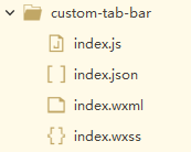
②自定义tabbar
在根目录创建custom-tab-bar文件夹,里面创建index.js、index.json、index.wxml、index.wxss文件进行开发,而不是vue文件,uniapp编译器会直接拷贝该目录到微信小程序中。
在index.js中:
Component({
  /**
   * 组件的属性列表
   */
  properties: {
  },
  /**
   * 组件的初始数据
   */
  data: {
    selected: 0,
    color: "#fff",
    selectedColor: "#6777FD",
    list: [{},{},{}]
  },
  /**
   * 组件的方法列表
   */
  methods: {
    switchTab(e) {
      const data = e.currentTarget.dataset
      const url = data.path
      wx.switchTab({ url })
    },
  }
})
注意:如需实现 tab 选中态,要在当前页面下,通过 getTabBar 接口获取组件实例,并调用 setData 更新选中态
onShow() {
	// 原生微信小程序
	 if (typeof this.getTabBar === 'function' && this.getTabBar()) {
      this.getTabBar().setData({
        selected: 0
      })
    }
	// vue2
	if (typeof this.$mp.page.getTabBar === 'function' && this.$mp.page.getTabBar()) {
		this.$mp.page.getTabBar().setData({
			selected: 0
		})
	}
	// vue3
	if (typeof this.scope.page.getTabBar === 'function' && this.scope.page.getTabBar()) {
		this.scope.page.getTabBar().setData({
			selected: 0
		})
	}
}
二、具体案例
在pages.json中:
"tabBar": {
	"color": "#ffffff",
	"selectedColor": "#6777FD",
	"custom": true,
	"list": [{
			"pagePath": "pages/aboutFind/use/use",
			"iconPath": "static/image/icon_find2.png",
			"selectedIconPath": "static/image/icon_find1.png",
			"text": "使用"
		},
		{
			"pagePath": "pages/index/index",
			"iconPath": "static/image/icon_go2.png",
			"selectedIconPath": "static/image/icon_go1.png",
			"text": "通行"
		},
		{
			"pagePath": "pages/myInfo/myInfo",
			"iconPath": "static/image/icon_set2.png",
			"selectedIconPath": "static/image/icon_set1.png",
			"text": "我的"
		}
	]
}
①自定义公共组件
在CustomTabBar.vue中:
					{{item.text}}


export default {
	props: {
		selected: Number
	},
	data() {
		return {
			color: "#fff",
			selectedColor: "#6777FD",
			list: [{
					pagePath: "/pages/aboutFind/use/use",
					text: "使用",
					iconPath: "/static/image/icon_find2.png",
					selectedIconPath: "/static/image/icon_find1.png"
				},
				{
					pagePath: "/pages/index/index",
					text: "通行",
					iconPath: "/static/image/icon_go2.png",
					selectedIconPath: "/static/image/icon_go1.png",
					search: true
				},
				{
					pagePath: "/pages/myInfo/myInfo",
					text: "我的",
					iconPath: "/static/image/icon_set2.png",
					selectedIconPath: "/static/image/icon_set1.png"
				}
			]
		}
	},
	methods: {
		switchTab(url) {
			uni.switchTab({
				url
			})
		}
	}
}


.tabBar {
	z-index: 100;
	width: 100%;
	position: fixed;
	bottom: 0;
	font-size: 28rpx;
	background-color: #fff;
	color: #636363;
	border-radius: 50rpx 50rpx 0px 0px;
}
.cont {
	z-index: 0;
	height: calc(100rpx + env(safe-area-inset-bottom) / 2);
	padding-bottom: 30rpx;
	display: flex;
	justify-content: space-around;
	.item {
		font-size: 24rpx;
		position: relative;
		width: 15%;
		text-align: center;
		padding: 0;
		display: block;
		height: auto;
		line-height: 1;
		margin: 0;
		background-color: inherit;
		overflow: initial;
		justify-content: center;
		align-items: center;
		padding-top: 20rpx;
	}
	.item:first-child {
		right: 45rpx;
	}
	.item:last-child {
		left: 45rpx;
	}
	.item image:first-child {
		width: 43rpx !important;
		height: 43rpx !important;
		margin: auto
	}
	.item image:last-child {
		width: 41rpx !important;
		height: 43rpx !important;
		margin: auto
	}
	.txt {
		margin-top: 20rpx;
	}
	.on {
		position: relative;
	}
	.on:not(:nth-child(2)):before {
		content: "";
		display: block;
		position: absolute;
		top: 0;
		width: 100%;
		height: 6rpx;
		background-color: #00BCD4;
		border-radius: 120rpx !important;
	}
	.search {
		position: absolute;
		left: 50%;
		transform: translate(-50%, 0);
		top: -50rpx;
		display: flex;
		flex-direction: column;
		justify-content: center;
		align-items: center;
	}
	.search image {
		width: 100rpx !important;
		height: 100rpx !important;
		z-index: 2;
		border-radius: 100%;
	}
	.search .txt {
		margin-top: 26rpx;
	}
	.selectedColor {
		color: #00BCD4;
	}
}
在使用到CustomTabBar.vue组件的三个页面中,如index首页:
	import CustomTabBar from "@/components/CustomTabBar/CustomTabBar.vue"
	export default {
		components: {
			CustomTabBar
		}
	}
②自定义tabbar
在index.js中:
Component({
  /**
   * 组件的属性列表
   */
  properties: {
  },
  /**
   * 组件的初始数据
   */
  data: {
    selected: 0,
    color: "#fff",
    selectedColor: "#6777FD",
    list: [
      {
        pagePath: "/pages/aboutFind/use/use",
        text: "使用",
        iconPath: "/static/image/icon_find2.png",
        selectedIconPath: "/static/image/icon_find1.png"
      },
      {
        pagePath: "/pages/index/index",
        text: "通行",
        iconPath: "/static/image/icon_go2.png",
        selectedIconPath: "/static/image/icon_go1.png",
        search: true
      },
      {
        pagePath: "/pages/myInfo/myInfo",
        text: "我的",
        iconPath: "/static/image/icon_set2.png",
        selectedIconPath: "/static/image/icon_set1.png"
      }
    ]
  },
  /**
   * 组件的方法列表
   */
  methods: {
    switchTab(e) {
      const data = e.currentTarget.dataset
      const url = data.path
      wx.switchTab({ url })
    },
  }
})
在index.json中:
{
  "component": true,
  "usingComponents": {}
}
在index.wxml中:
免责声明:我们致力于保护作者版权,注重分享,被刊用文章因无法核实真实出处,未能及时与作者取得联系,或有版权异议的,请联系管理员,我们会立即处理! 部分文章是来自自研大数据AI进行生成,内容摘自(百度百科,百度知道,头条百科,中国民法典,刑法,牛津词典,新华词典,汉语词典,国家院校,科普平台)等数据,内容仅供学习参考,不准确地方联系删除处理! 图片声明:本站部分配图来自人工智能系统AI生成,觅知网授权图片,PxHere摄影无版权图库和百度,360,搜狗等多加搜索引擎自动关键词搜索配图,如有侵权的图片,请第一时间联系我们,邮箱:ciyunidc@ciyunshuju.com。本站只作为美观性配图使用,无任何非法侵犯第三方意图,一切解释权归图片著作权方,本站不承担任何责任。如有恶意碰瓷者,必当奉陪到底严惩不贷!


