HarmonyOS应用开发ArkUI(TS)电商项目实战


.png)

项目介绍
本项目基于 HarmonyOS 的ArkUI框架TS扩展的声明式开发范式,关于语法和概念直接看官网官方文档地址:基于TS扩展的声明式开发范式,
工具版本: DevEco Studio 3.1 Canary1
SDK版本: 3.1.9.7(API Version 8 Release)
效果演示
页面解析
主框架
使用容器组件:Tabs 、TabContent、作为主框架,底部Tab使用自定义布局样式,设置点击事件,每次点击更换选中的索引。来切换内容页面。
使用自定义组件来实现:首页、分类、购物车、我的的搭建。
@Entry
@Component
struct MainFrame {
  @State selectIndex: number = 0
  private controller: TabsController = new TabsController()
  private tabBar = getTabBarList()
  // 内容
  @Builder Content() {
    Tabs({ controller: this.controller }) {
      TabContent() {HomeComponent()}
      TabContent() {ClassifyComponent()}
      TabContent() {ShoppingCartComponent({ isShowLeft: false })}
      TabContent() {MyComponent()}
    }
    .width('100%')
    .height(0)
    .animationDuration(0)
    .layoutWeight(1)
    .scrollable(false)
    .barWidth(0)
    .barHeight(0)
  }
  // 底部导航
  @Builder TabBar() {
    Row() {
      ForEach(this.tabBar, (item: TabBarModel, index) => {
        Column() {
          Image(this.selectIndex === index ? item.iconSelected : item.icon)
            .width(23).height(23).margin({ right: index === 2 ? 3 : 0 })
          Text(item.name)
            .fontColor(this.selectIndex === index ? '#dc1c22' : '#000000')
            .margin({ left: 1, top: 2 })
        }.layoutWeight(1)
        .onClick(() => {
          this.selectIndex = index
          this.controller.changeIndex(index)
        })
      }, item => item.name)
    }.width('100%').height(50)
    .shadow({ radius: 1, color: '#e3e2e2', offsetY: -1 })
  }
  build() {
    Column() {
      this.Content()
      this.TabBar()
    }.width('100%').height('100%')
  }
}
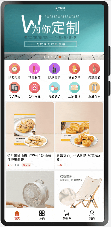
首页
因为顶部标题栏需要浮在内容之上,所以根布局使用 容器组件Stack ,内容布局最外层使用 容器组件Scroll 来实现滑动,内容整体分为3部分:
- 轮播图:使用 容器组件Swiper
- 菜单:使用 容器组件Flex 、默认横向布局,子布局宽度分为五等分,设置Flex的参数:wrap: FlexWrap.Wrap可实现自动换行。
- 商品列表:和菜单的实现方式一样,只不过宽度是二等分
向下滑动时标题栏显示功能:使用 容器组件Scroll 的属性方法:onScroll来判断y轴方向的偏移量,根据偏移量计算出比例,改变标题栏的透明度。

(以下是部分代码)
@Component
export struct HomeComponent {
  // 滑动的y偏移量
  private yTotalOffset = 0
  // 标题栏透明度
  @State titleBarOpacity: number = 0
  // 轮播图列表
  private banners = [
    $r("app.media.banner1"), $r("app.media.banner2"), $r("app.media.banner3"),
    $r("app.media.banner4"), $r("app.media.banner5"), $r("app.media.banner6"),
  ]
  // 菜单列表
  private menuList = getHomeMenuList()
  // 商品列表
  private goodsList: Array = getHomeGoodsList()
  // 轮播图
  @Builder Banner() {...}
  // 菜单
  @Builder Menu() {....}
  // 商品列表
  @Builder GoodsList() {...}
  build() {
    Stack({ alignContent: Alignment.Top }) {
      Scroll() {
        Column() {
          this.Banner()
          this.Menu()
          this.GoodsList()
        }.backgroundColor(Color.White)
      }.scrollBar(BarState.Off)
      .onScroll((xOffset, yOffset) => {
        this.yTotalOffset += yOffset
        const yTotalOffsetVP = px2vp(this.yTotalOffset)
        // 轮播图高度 350
        const scale = yTotalOffsetVP / 200
        this.titleBarOpacity = scale
      })
      Row(){
        TitleBar({
          title: '首页',
          isShowLeft: false,
          isShowRight: true,
          rightImage: $r('app.media.search')
        })
      }.opacity(this.titleBarOpacity)
    }.width('100%').height('100%')
  }
}
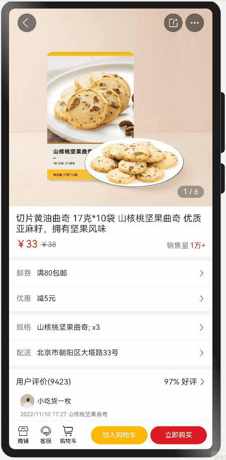
详情页
和首页类似,根布局使用容器组件Stack,内容布局最外层使用容器组件Scroll 来实现滑动。因为详情页有相同布局,使用装饰器@Builder来抽离公共布局。
向下滑动时标题栏显示功能原理和首页一样
(以下是部分代码)
import router from '@ohos.router';
@Entry
@Component
struct GoodsDetail {
  ....
  // 轮播图
  @Builder Banner() {...}
  // 内容item
  @Builder ContentItem(title: string, content: string, top=1) {
    Row() {
      Text(title).fontSize(13).fontColor('#808080')
      Text(content).fontSize(13).margin({ left: 10 }).fontColor('#ff323232')
      Blank()
      Image($r('app.media.arrow')).width(12).height(18)
    }.width('100%').padding(13)
    .backgroundColor(Color.White).margin({ top: top })
  }
  // 内容
  @Builder Content() {
    ...
    this.ContentItem('邮费', '满80包邮', 7)
    this.ContentItem('优惠', '减5元')
    this.ContentItem('规格', '山核桃坚果曲奇; x3', 7)
    this.ContentItem('配送', '北京市朝阳区大塔路33号')
  }
  // 评论
  @Builder Comment() {...}
  // 商品参数item
  @Builder GoodsParamItem(title: string, content: string) {
    Row() {
      Text(title).width(100).fontSize(13).fontColor('#808080')
      Text(content).fontSize(13).fontColor('#ff323232')
        .layoutWeight(1).padding({ right: 20 })
    }.width('100%').padding({ top: 15 })
    .alignItems(VerticalAlign.Top)
  }
  // 商品参数
  @Builder GoodsParam() {...}
  build() {
    Stack() {
      Scroll() {
        Column() {
          this.Banner()
          this.Content()
          this.Comment()
          this.GoodsParam()
        }
      }.scrollBar(BarState.Off)
      .onScroll((xOffset, yOffset) => {
        this.yTotalOffset += yOffset
        const yTotalOffsetVP = px2vp(this.yTotalOffset)
        // 轮播图高度 350
        const scale = yTotalOffsetVP / 350
        this.titleBarBgTmOpacity = 1 - scale
        if (scale > 0.4) {
          this.titleBarBgWhiteOpacity = scale - 0.2
        } else {
          this.titleBarBgWhiteOpacity = 0
        }
      })
      this.TopBottomOperateBar()
    }.width('100%').height('100%')
    .backgroundColor('#F4F4F4')
  }
}
分类
此页面很简单,就是左右两个容器组件List、一个宽度30%,一个宽度70%,使用循环渲染组件ForEach来渲染列表。
(以下是部分代码)
@Component
export struct ClassifyComponent {
  // 搜索
  @Builder Search() {...}
  // 内容
  @Builder Content() {
    Row() {
      // 左分类
      List() {...}.width('30%')
      // 右分类
      List({scroller:this.scroller}) {...}.width('70%')
    }.width('100%').layoutWeight(1)
    .alignItems(VerticalAlign.Top)
  }
  build() {
    Column() {
      this.Search()
      this.Content()
    }.width('100%').height('100%')
    .backgroundColor(Color.White)
  }
}
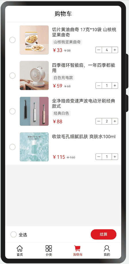
购物车
此界面功能:全选、单选、删除商品、更改商品的数量。当有商品选中,右上角删除按钮显示。更改商品数量同步更新合计的总价格。
使用List组件来实现列表。数据数组使用装饰器@State定义。数据更新必须是更改数组的项。
(以下是部分代码)
@Component
export struct ShoppingCartComponent {
  ...
  // 商品详情
  @Builder GoodsItem(item: ShoppingCartModel, index: number) {...}
  build() {
    Column() {
      TitleBar()

      if (this.list.length > 0) {
        // 列表
        List() {...}.layoutWeight(1)
        // 结算布局
        Row() {...}
      } else {
        Row() {
          Text('空空如也~')
        }
      }
    }.width('100%').height('100%')
    .backgroundColor('#F4F4F4')
  }
  selectOperation(item: ShoppingCartModel, index: number) {
    // 替换元素,才能更改数组,这样页面才能更新
    let newItem = {...item}
    newItem.isSelected = !item.isSelected
    this.list.splice(index, 1, newItem)
    this.calculateTotalPrice()
  }
  // 加/减操作
  addOrSubtractOperation(item: ShoppingCartModel, index: number, type: -1 | 1) {...}
  // 计算合计
  calculateTotalPrice() {
    let total = 0
    let selectedCount = 0
    for (const item of this.list) {
      if (item.isSelected) {
        selectedCount++
        total += item.newPrice * item.count
      }
    }
    this.totalPrice = total
    this.isAllSelected = selectedCount === this.list.length
  }
}
结尾
此项目没有比较难的点,都是照着官方文档,查阅API做出来的,依靠着声明式UI的简洁和强大,页面搭建效率很高。
文章版权声明:除非注明,否则均为主机测评原创文章,转载或复制请以超链接形式并注明出处。