
【前端】实现时钟网页


.png)

【前端】实现时钟网页


文章目录
- 【前端】实现时钟网页
- 项目介绍
- 代码
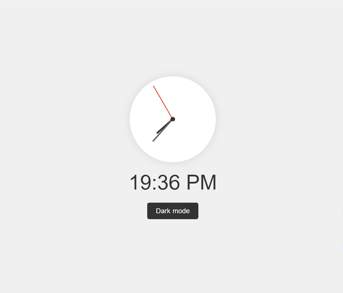
- 效果图
项目介绍
时钟显示在网页中央,并且使网页能够切换白天和夜晚两种模式。搭建基本的html结构,动态得到实时的时,分,秒
通过Date()函数获得。将得到的数字根据逻辑,绑定
给各div结构,实行动态旋转。点击按钮,改变背景颜色
给出最终的HTML代码。
代码
现代风格时钟 body { display: flex; justify-content: center; align-items: center; height: 100vh; margin: 0; font-family: Arial, sans-serif; background-color: #f0f0f0; transition: background-color 0.5s; } .clock-container { display: flex; flex-direction: column; align-items: center; } .clock { width: 200px; height: 200px; border-radius: 50%; background-color: white; position: relative; box-shadow: 0 0 20px rgba(0,0,0,0.1); } .hand { position: absolute; bottom: 50%; left: 50%; transform-origin: 50% 100%; border-radius: 5px; } .hour { width: 4px; height: 50px; background-color: #333; } .minute { width: 3px; height: 70px; background-color: #666; } .second { width: 2px; height: 90px; background-color: #e74c3c; } .center { position: absolute; top: 50%; left: 50%; width: 10px; height: 10px; border-radius: 50%; background-color: #333; transform: translate(-50%, -50%); } .digital-time { font-size: 48px; margin-top: 20px; color: #333; } .mode-switch { margin-top: 20px; padding: 10px 20px; font-size: 16px; cursor: pointer; background-color: #333; color: white; border: none; border-radius: 5px; transition: background-color 0.3s; } .mode-switch:hover { background-color: #555; } .night-mode { background-color: #222; } .night-mode .clock { background-color: #333; box-shadow: 0 0 20px rgba(255,255,255,0.1); } .night-mode .hour, .night-mode .minute { background-color: #fff; } .night-mode .second { background-color: #e74c3c; } .night-mode .center { background-color: #fff; } .night-mode .digital-time { color: #fff; } .night-mode .mode-switch { background-color: #f0f0f0; color: #333; } .night-mode .mode-switch:hover { background-color: #ddd; }function updateClock() { const now = new Date(); const hours = now.getHours(); const minutes = now.getMinutes(); const seconds = now.getSeconds(); const hourDeg = (hours % 12 + minutes / 60) * 30; const minuteDeg = (minutes + seconds / 60) * 6; const secondDeg = seconds * 6; document.querySelector('.hour').style.transform = `translateX(-50%) rotate(${hourDeg}deg)`; document.querySelector('.minute').style.transform = `translateX(-50%) rotate(${minuteDeg}deg)`; document.querySelector('.second').style.transform = `translateX(-50%) rotate(${secondDeg}deg)`; const digitalTime = `${hours.toString().padStart(2, '0')}:${minutes.toString().padStart(2, '0')} ${hours >= 12 ? 'PM' : 'AM'}`; document.querySelector('.digital-time').textContent = digitalTime; } function toggleMode() { document.body.classList.toggle('night-mode'); const button = document.querySelector('.mode-switch'); button.textContent = document.body.classList.contains('night-mode') ? 'Light mode' : 'Dark mode'; } setInterval(updateClock, 1000); updateClock(); // 立即更新一次,避免延迟 document.querySelector('.mode-switch').addEventListener('click', toggleMode);Dark mode效果图
文章版权声明:除非注明,否则均为主机测评原创文章,转载或复制请以超链接形式并注明出处。

")


