
前端 CSS 经典:水波进度样式
前言:简单实现水波进度样式,简单好看。
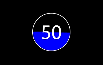
效果图:
代码实现:
    document

      body {
        background: #000;
      }
      .indicator {
        display: flex;
        align-items: center;
        justify-content: center;
        font-size: 3em;
        margin: 200px auto;
        width: 100px;
        height: 100px;
        border-radius: 50%;
        border: 2px solid #fff;
        position: relative;
        overflow: hidden;
        color: #fff;
      }
      .indicator span {
        position: absolute;
        z-index: 999;
      }
      .indicator::after {
        content: "";
        width: 200px;
        height: 200px;
        border-radius: 60px;
        position: absolute;
        left: -50%;
        top: 50px;
        background: blue;
        animation: rotate 5s linear 0s infinite;
      }
      @keyframes rotate {
        from {
          transform: rotateZ(0deg);
        }
        to {
          transform: rotateZ(359deg);
        }
      }


        50
免责声明:我们致力于保护作者版权,注重分享,被刊用文章因无法核实真实出处,未能及时与作者取得联系,或有版权异议的,请联系管理员,我们会立即处理! 部分文章是来自自研大数据AI进行生成,内容摘自(百度百科,百度知道,头条百科,中国民法典,刑法,牛津词典,新华词典,汉语词典,国家院校,科普平台)等数据,内容仅供学习参考,不准确地方联系删除处理! 图片声明:本站部分配图来自人工智能系统AI生成,觅知网授权图片,PxHere摄影无版权图库和百度,360,搜狗等多加搜索引擎自动关键词搜索配图,如有侵权的图片,请第一时间联系我们,邮箱:ciyunidc@ciyunshuju.com。本站只作为美观性配图使用,无任何非法侵犯第三方意图,一切解释权归图片著作权方,本站不承担任何责任。如有恶意碰瓷者,必当奉陪到底严惩不贷!


